Facebook
 X
X
 Pinterest
 Copy Link


This video is the latest in our Monday with Matthew series with Windermere Chief Economist Matthew Gardner. Each month, he analyzes the most up-to-date U.S. housing data to keep you well-informed about what’s going on in the real estate market.
Hello there, I’m Windermere’s Chief Economist Matthew Gardner and welcome to this month’s episode of Monday with Matthew.
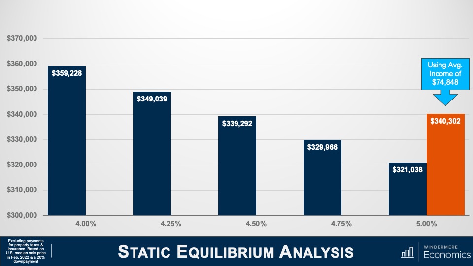
If you’ve listened to me at all over the past several years, you’ll know that I am pretty passionate about one subject: housing affordability. And, given the significant price growth that we’ve seen over the past decade, as well as the recent spike in mortgage rates, I wanted to talk a little bit about what might be done to address this very serious issue.
The Growing Housing Affordability Problem
Now, when we think about housing affordability and how it might be solved, a lot of people get tied up in the minutiae when, quite frankly, it really isn’t that hard a problem to solve. You see, there’s one very simple way to address this: to build more housing units. But, as easy as that may sound, there are a lot of obstacles that are holding new supply back. But before I get to that, I want to share some data with you that might help to demonstrate how serious an issue we all face.
Every quarter, the National Association of Homebuilders puts out its affordability numbers for metro areas across the country. An analysis of sales and incomes allows them to show the number of homes—both new and existing—sold in a quarter that were affordable to households making median income.
Housing is Increasingly Unaffordable
Here you will see numbers from just a few of the 240 metropolitan areas across the country and the share of sales in the first quarter of this year that were “technically” affordable. I think you’ll agree that it’s eye opening.
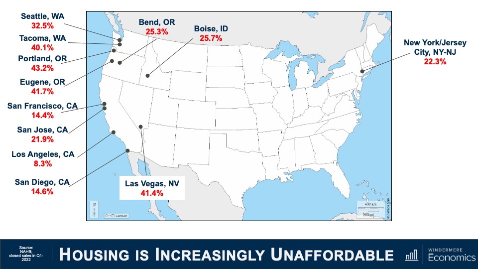
Although I am only showing you a few of the U.S. markets I will tell you that the ten least affordable US housing markets were all in California. The Golden State is also home to 21 of the top 25 least affordable markets in the country. But what you might also find interesting is that our primary cities aren’t the only ones that are suffering from affordability issues, with markets like Bend, Oregon; Boise, Idaho; and even Las Vegas, Nevada becoming increasingly unaffordable for a lot of households.
And it’s worth mentioning that that 48 of the 69 markets where less than half of the homes sold were affordable were in states that have at some point in the past implemented comprehensive planning and growth management legislation. And when governments mandate where homes can and cannot be built, one thing happens: it pushes land prices higher which makes new homes more expensive and limits the amount of new supply that builders are able to provide. So, what can be done?
Well, I will start out by saying that states who have implemented growth management plans, which they generally did to slow or stop suburban sprawl, remain disinclined to move these boundaries, and that means it becomes paramount to not look further out but to concentrate within the urban growth boundaries and decide whether it’s time to think about removing single-family zoning altogether.
This is a fascinating thought, but I must add that I am not suggesting that we do away with single-family homes. Absolutely not! What I am thinking about is the ability for a market to decide what makes the most sense. In order to do so, single-family zones need to allow for the development of denser housing, but also allow the market to decide what’s best. Areas that have implemented such change has given rise to a movement in order to address what is being referred to as “missing middle housing.” For those of you who are unfamiliar with this term let me try and explain.
Missing Middle Housing
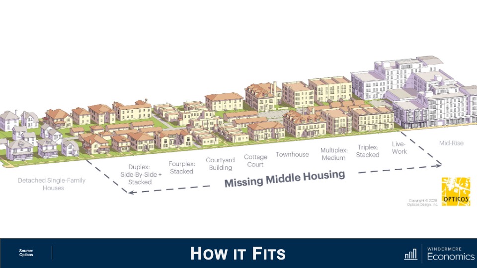
This is a great image courtesy of Opticos, a team of urban designers, architects, and strategists who are passionate about adding sorely needed housing options.
They came up with the term “missing middle” as it describes housing types that were actually very common prior to World War II where duplexes, row-homes, and courtyard apartments were in high demand. Unfortunately, however, they are now far less common and, therefore, “missing.”
And the key function of this type of housing is to meet the rising demand for walkable neighborhoods, respond to changing demographics, and provide housing at different price points. You see, rather than focusing on the number of units in a structure—think high rise apartments or condominiums—this type of housing emphasizes scale and heights that are appropriate for and sympathetic to single-family or transitional neighborhoods.
The Decline of Missing Middle Housing Construction
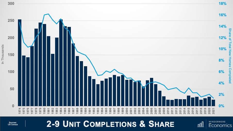
And to show you how supply of these types of units has changed, this chart shows the number of duplexes to eight-unit buildings built over the past almost half-century and you can clearly see that up until the late 1980s they were being built in decent numbers, but the 1990s saw a significant shift toward traditional single-family home ownership and builders followed the demand and this type of product started to become scarcer.
Almost 16% of total new homes built in America in the early 1980s were of this style, but that number has now shrunk to just 1.4%—or a paltry 19,000 units.
But I see demand for these housing types growing as we move forward and that buyers or renters, young and old, will be attracted as it will meet their requirements not only in regards to the type of home they would want to live in but, more importantly, it can be built cheaper than traditional single-family housing and therefore it will be more affordable.
But although this sounds like it’s a remarkably simple solution that can solve all our woes, in reality it’s not that easy for two very specific reasons. The first is that many markets are already essentially built out, meaning that in order to develop this type of product, a builder would have to purchase a number of existing homes and raze them in order to rebuild. But given current home values, it’s very hard for a builder to be able to make such a proposal financially.
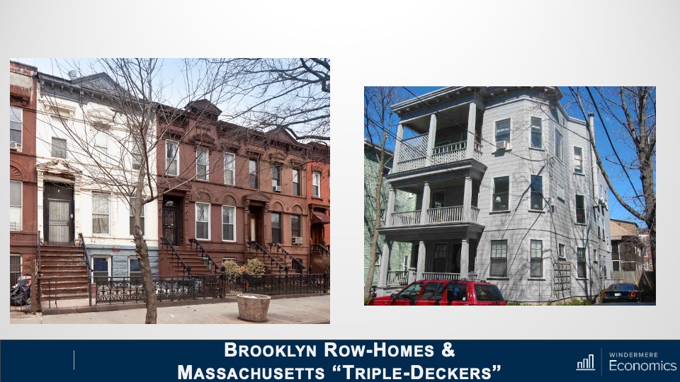
And the second issue is that current residents within these “transition” areas—which have been developed as traditional single-family neighborhood—simply don’t want to see change. But is this type of product bad? Here are some examples.
This shows row-homes in Brooklyn on the left and traditional “triple-deckers” in Massachusetts on the right:
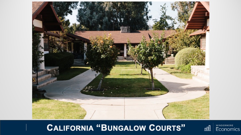
This is a bungalow court project in California:
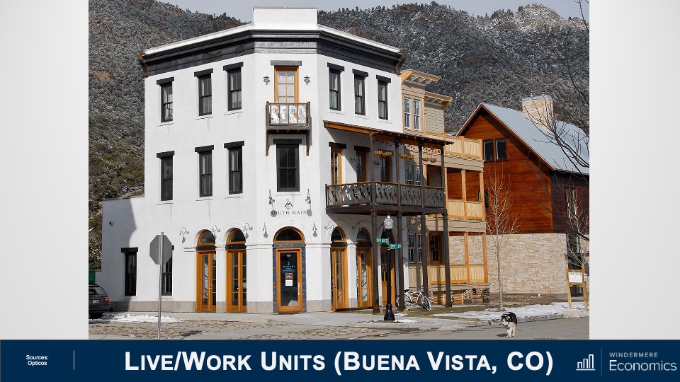
Here are some Live/Work Units in Colorado:
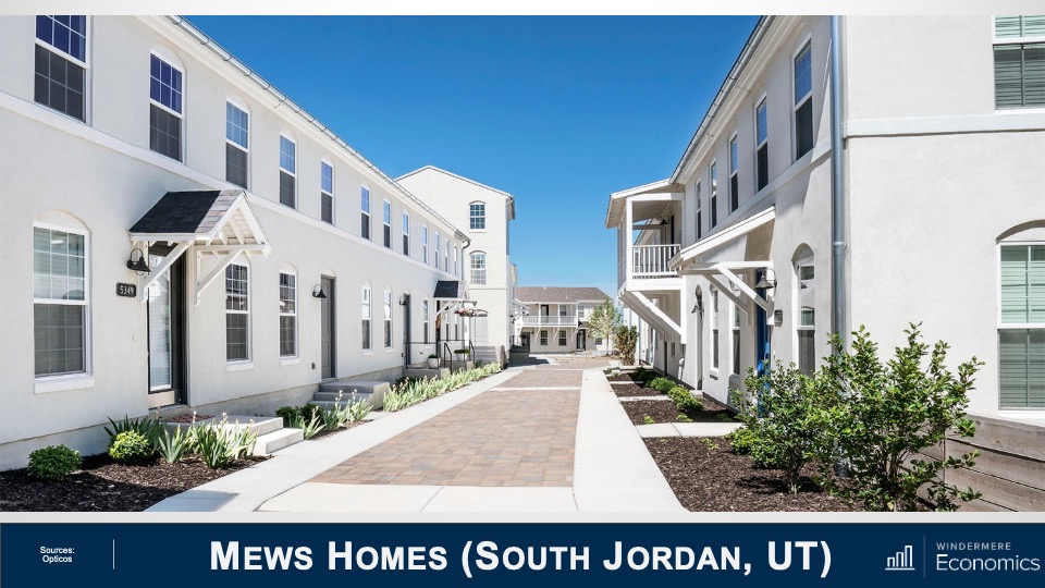
These are some amazing mews homes in Utah:
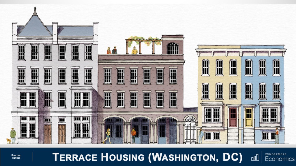
And finally, a new terrace housing project that will be built in Washington DC:
Don’t get me wrong, I’m sure that some of you who simply aren’t inspired by this type of architecture, and that is understandable. But can we simply stick with the status-quo? I don’t think so. And some state legislators have already implemented significant zoning amendments in order to try and encourage this type of development.
Back in 2018, Minneapolis was the first city to allow this type of development inside single-family zoned areas. This was followed by Oregon State in 2019. Senate Bill 9 was signed by Governor Newsom of California last year which made it legal for property owners to subdivide lots into two parcels and turn single-family homes into duplexes, effectively legalizing fourplexes on land previously reserved for single-family homes. So, we are starting to see some change.
This is a good start but as I mentioned earlier in areas that are already built out, even this type of forward-thinking legislation will not be the panacea that some want. But I’m not giving up hope.
Addressing the “missing middle housing” would allow for homes of all shapes and sizes, for people of all incomes including workers who are essential to our economy and community. Here I am talking about our teachers, firefighters, administrative assistants, childcare providers, and nurses—just to name a few!
There are currently 45 million Americans aged between 25 and 34 and most aspire to homeownership. However, the massive price growth which, by the way, many of us have benefitted from over the past several years, has simply put a “starter home” out of their reach.
I will leave you with one last statistic. Over 28% of American households today are made up of a single people living alone, and it is anticipated that up to 85% of all U.S. households will not include children by the year 2025. Finally, by 2030, one in five Americans will be over the age of 65.
Are we going to meet the needs of the country’s changing demographic going forward? I certainly hope so, but it will take a lot of work for us to get there. As always, if you have any questions or comments about this particular topic, please do reach out to me but, in the meantime, stay safe out there and I look forward to visiting with you all again next month.